About Windows 8.1
10月
4日
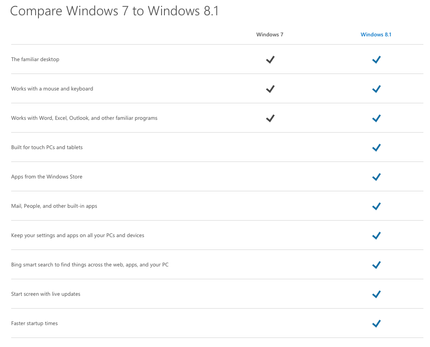
Start screen "KAK Metro Screen" is great for a smartphones which as very small screen. Having the open App icons line up at the bottom is great but why can't I keep all the most used App icons at the bottom and get rid Start screen. Instead, start button should show the list of Apps available.
Well, that what we had as Windows 7. PC's are not smartphones or tablets. I still like Windows XP or Windows 2000 design better.


