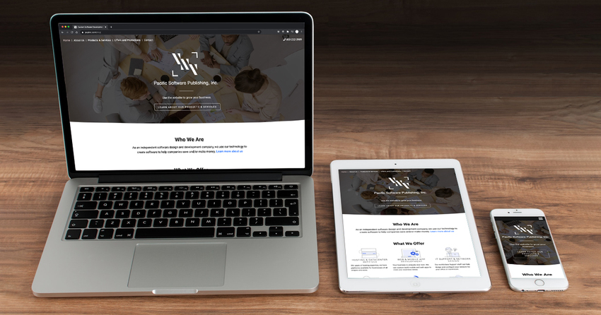
What is responsive design?
2月
10日
With the advent of mobile devices (phones and tablets) of all shapes and sizes, this proved problematic. Having to pinch and zoom and scroll horizontally as well as vertically made the web viewing experience hard to navigate.
Enter "Responsive Design"
Responsive Design is an approach that makes web pages render appropriately on a variety of devices or screen resolutions. How it works is elements of the website change position, size, and visibility depending on how much space is available.
Where you may have a multi-column website layout on a desktop computer, a general rule is you would scale down to a single column display on a mobile device so everything stacks nicely. With a phone, it is really easy to swipe vertically with your thumb to navigate content.
More than one way to build a responsive website
There are many methods, approaches, and strategies for Web Developers to create a responsive website. A couple popular ways to build a responsive website are:
- Mobile-first: It’s the idea of first building a website for the lowest browser size (mobile). This version should display the most basic functions and features. Anything that is perhaps unnecessary is hidden or pushed further down the page. As you advance to tablets and PC’s, additional interactions, effects, and complex layouts are slowly added over time.
- Graceful degradation: This is the opposite, you start with the design at the most advanced end (desktop computers). As you scale down you start to limit functions, reduce the number of columns, and deliver a beautiful single-column mobile experience.
Both options have their pros and cons. Regardless of the approach, having a Designer making thoughtful choices is critical to ensuring your website is best optimized for whatever device your customer is using when navigating to your URL.
A few important considerations when building a responsive website
- As your website scales down to mobile, your navigation should be contained within a ‘hamburger menu’. It is a fairly universal practice to manage your navigation, users can click to expand a full list of navigation items. This will save you space and make your nav links more manageable.
- Previously mentioned, but as you scale down to mobile it is best to utilize a single column layout and stack everything to make it easy to read.
- Make sure to utilize proper line height, spacing, and size for your typography as your screen size decreases.
We are really just scratching the surface here on responsive design. There is a lot to learn and take into consideration when planning your website.
If you don’t know whether your website is responsive or not, test it for yourself. Size your browser window down until it is really small. If the elements on your page don’t adjust and you are stuck with a horizontal scroll bar in your browser, odds are your site is NOT responsive.
It can be overwhelming but if you need advice or help with designing and developing a responsive website please let us know. We have a team of talented Designers and Developers skilled at making responsive websites. You can visit our Design Solutions page to take a look at our work and learn more about what we can do. You can call us toll-free 1-800-232-3989 or request a quote online.
|
Pacific Software Publishing, Inc. 1404 140th Place N.E., Bellevue, WA 98007 |
| PSPinc Creates Tools For Your Business |
| Pacific Software Publishing, Inc. is headquartered in Bellevue, Washington and provides domain, web, and email hosting to more than 40,000 companies of all sizes around the world. We design and develop our own software and are committed to helping businesses of all sizes grow and thrive online. For more information you can contact us at 800-232-3989, by email at info@pspinc.com or visit us online at https://www.pspinc.com. |


